What’s machine learning:
In simple terms , it’s the process of teaching machines to solve particular problems without being explicitly programmed .
Sounds fascinating ,but how does one teaches a machine? The answer is using math ,some smart people have figured out ways to simulate how humans learn which is by observation. The core of the machine learning process reduces to feeding a machine learning model a bunch of observations with the corresponding labels which we call “training” . then testing the model observations that it didn’t see in the training phase which we call “validation”, a better model has more accurate validation results.
Example : Teach a machine how tell if a picture is a cat or a dog
Step 1 : get a huge number of pictures of cats and dogs and classify them yourself
Step 2 : feed an ML model the pictures , watch it learn.
Step 3 : get new pictures of cats and dogs and test if your models perform well
The competition:
“House prices” is a kaggle competition under the knowledge section , it is meant for beginners to practice their datascience skills . The objective is to predict a house’s price given a bunch of information about it for example : it’s area ,pool’s availability …
It’s pretty complicated to tackle this kind of challenges without proper background , so in this article we’ll go through the typical machine learning process while simplifying any ambiguous statistical terms , so only basic math skills will be required.
We’ll start by exploratory data analysis which aims to get a feel of the data by observing ,analyzing it using graphs , this will help us identify important features , spot irregularities …
Then we’ll do a little bit of data cleaning and preprocessing, so we’ll fix any problems with the data and prepare it to be swollen by our model
Finally , we’ll use our clean data and feed it to a model of our choice , in this tutorial we’ll be using a simple linear regression model , then we will explore the different ways to evaluate our model’s performance and we’ll also try to improve it.
Exploratory data analysis:
The first step is to download the dataset from the competition’s webite :
House Prices: Advanced Regression Techniques
Predict sales prices and practice feature engineering, RFs, and gradient boosting
We’ll get “train.csv”, “test.csv” and “data_description.txt” which explains what each column means.
Then import the required libraries : seaborn and matplotlib for visualisation , pandas and numpy for data wrangling
import pandas as pd
import matplotlib.pyplot as plt
import seaborn as sns
import numpy as np
%matplotlib inline
We can use Pandas to read in csv files. The pd.read_csv() method creates a DataFrame from a csv file.
train = pd.read_csv('train.csv')
test = pd.read_csv('test.csv')
Let’s check the size of the data:
print ("Train size:", train.shape)
print ("Test size:", test.shape)Train size: (1460, 81)
Test size: (1459, 80)
We can see that the test data has one missing column which is the price of the house which makes sense cause that’s what we need to predict in the competition.
Now we’ll look at a few rows of the data using DataFrame.head() method.
train.head()

We can notice that some of the columns such as PoolQC have missing values. We’ll deal with that later.
To make some sense of the column names we can check the data description file. Here’s a brief version of what you’ll find there.
SalePrice— the property’s sale price in dollars. This is the target variable that we’re trying to predict.MSSubClass— The building classMSZoning— The general zoning classificationLotFrontage— Linear feet of street connected to propertyLotArea— Lot size in square feetStreet— Type of road access
We’re trying to predict the salePrice column using all the other available columns , to get more information about our target variable we can use the describe command
train[salePrice].describe()out :count      1460.000000
mean     180921.195890
std       79442.502883
min       34900.000000
25%      129975.000000
50%      163000.000000
75%      214000.000000
max      755000.000000
Name: SalePrice, dtype: float64
count gives the number of price observations available , the mean is the average sale price, we also get the standard deviation which is a measure of the dispersion in prices , we also get the min , max , and percentiles (explain this later)
We’ll dive deeper in the salePrice analysis by checking the plotting a historgram and checking it’s skew value.
plt.rcParams['figure.figsize'] = [15, 10]
sns.distplot(train['SalePrice']);
print("Skewness: %f" % df['SalePrice'].skew())
a histogram of the sale price
Skewness, is the degree of distortion from a normal distribution, in a set of data. A distribution with 0 skewness is perfectly symmetrical. A positive skewness indicates an assymetry to the left and a negative one is to the right
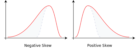
Skewness is a problem because it can make our linear regression model inaccurate. We’ll be dealing with it in the preprocessing phase.
To get a feel of the data we’ll plot some variables and see their effect on price.
We’ll start by the living Area
sns.scatterplot(x='GrLivArea',y='SalePrice',data=df)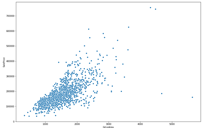
There’s a clear linear relationship , which is good for our model. We can also see some outliers ( Some houses with really large areas and low price) .Outliers can damage the quality of the model so we’ll have to delete them.
We’ll now check the salePrice vs the Overall quality
sns.boxplot(x='OverallQual',y='SalePrice',data=df)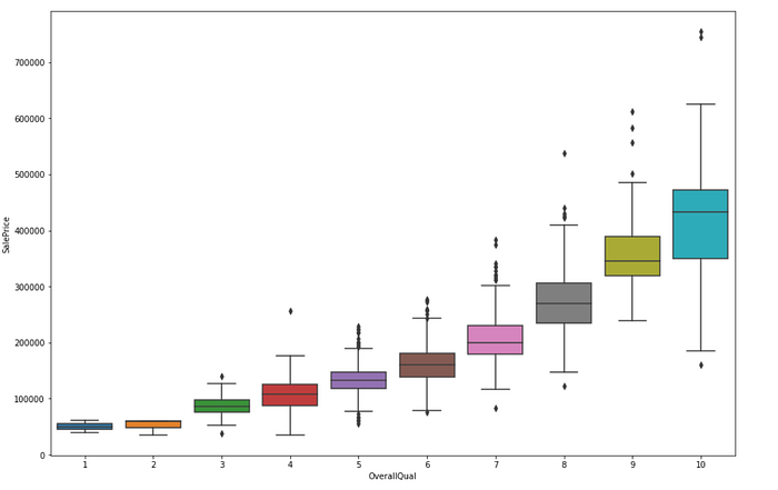
As expected when the quality increases so does the sale price
Finally , to identify the most important variables we’ll check the correlation matrix and rank the variables based on their correlation with the target variable.
#correlation heatmap
sns.heatmap(df.corr())
#correlations sorting
#top correlated variables
df.corr()['SalePrice'].sort_values(ascending=False)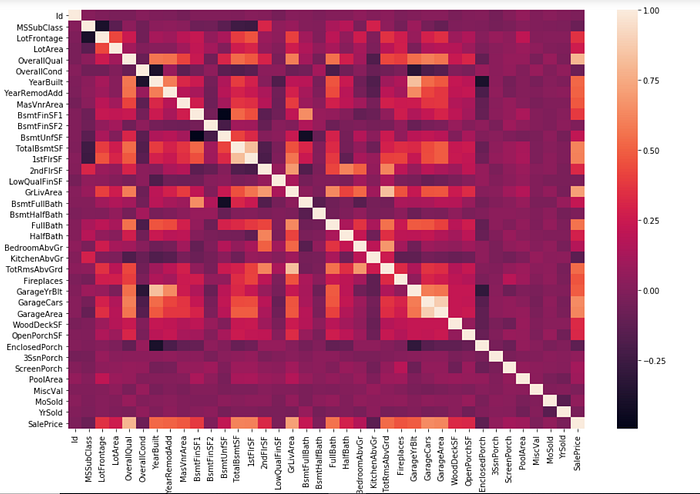
Top correlated variables :

SalePrice        1.000000
OverallQual      0.790982
GrLivArea        0.708624
GarageCars       0.640409
GarageArea       0.623431
TotalBsmtSF      0.613581
1stFlrSF         0.605852
FullBath         0.560664
TotRmsAbvGrd     0.533723
YearBuilt        0.522897
YearRemodAdd     0.507101
GarageYrBlt      0.486362
MasVnrArea       0.477493
Fireplaces       0.466929
BsmtFinSF1       0.386420
LotFrontage      0.351799
WoodDeckSF       0.324413
2ndFlrSF         0.319334
OpenPorchSF      0.315856
HalfBath         0.284108
LotArea          0.263843
BsmtFullBath     0.227122
BsmtUnfSF        0.214479
BedroomAbvGr     0.168213
ScreenPorch      0.111447
PoolArea         0.092404
MoSold           0.046432
3SsnPorch        0.044584
Data preprocessing :
Handling Null Values:
Next, we’ll examine the null or missing values. We’ll check their number across various variables and also an important mesure which is the percentage of null values of the column’s data.
#missing data count and percentage
total = train.isnull().sum().sort_values(ascending=False)
percent = (train.isnull().sum()/train.isnull().count()).sort_values(ascending=False)
missing_data = pd.concat([total, percent], axis=1, keys=['Total', 'Percent'])
missing_data.head(20)
We see that for the PoolQc , MiscFeature , Alley and Fence most the datapoints are null. Althought not the best path , one way to deal with missing data is to fill it with coulumn’s mean which we can do easily using fillna() method.
train = train.fillna(all_data.mean())Removing outliers:
When we visualized the living area vs SalePrice in the EDA section we found few datapoints that clearly don’t follow the trend, in statistics we call them outliers and they’re can make the model less accurate. In our case to remove those datapoints we can target the houses which the area exceeds 4000 m²
#remove outliers
train = train[train.GrLivArea < 4000]
sns.scatterplot(x=df.GrLivArea, y=df.SalePrice)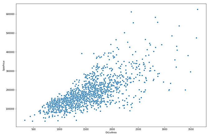
Handling skewness:
We found positive skewness in the salePrice , to deal with that a common method is to use the log transform. To do that we can use the np.log1p() function. Then we plot again to check if that worked.
train.SalePrice = np.log1p(train.SalePrice)sns.distplot(df['SalePrice'], fit=norm);
fig = plt.figure()
As you can see our plot in blue is now very close to a normal distribution !
There’s indeed more variables with skewness that we’d like to remove. A good way to do that is to mesure their skewness and apply the log transform to variables which the skewness exceeds a certain value.
#log transform all the numerical skewed data
#get all numerical features
numeric_feats = train.dtypes[train.dtypes != "object"].indexskewed_feats = train[numeric_feats].apply(lambda x: x.skew()) #compute skewnessskewed_feats = skewed_feats[skewed_feats > 0.75]skewed_feats = skewed_feats.indexprint(skewed_feats)train[skewed_feats] = np.log1p(train[skewed_feats])out : Index(['MSSubClass', 'LotFrontage', 'LotArea', 'MasVnrArea','BsmtFinSF1','BsmtFinSF2', 'BsmtUnfSF', 'TotalBsmtSF', '1stFlrSF', '2ndFlrSF','LowQualFinSF', 'GrLivArea', 'BsmtHalfBath','KitchenAbvGr','TotRmsAbvGrd', 'WoodDeckSF', 'OpenPorchSF','EnclosedPorch','3SsnPorch','ScreenPorch''PoolArea','iscVal'],dtype='object')
Turning categorical columns into dummy variables:
Linear regression models can’t handle categorical data , so a common way to solve that probem is to turn categories into new binary columns . For example a column for sex with “male” and “female” will turn into two binary columns named “male” and “female” which can take 0 or 1 as values. We can do that easily in pandas using the built in pd.get_dummies() function.
train = pd.get_dummies(train)Modeling :
The final step is modeling we’ll be building a simple linear model
from sklearn import datasets, linear_model
from sklearn.metrics import mean_squared_error, r2_score
# Create linear regression object
regr = linear_model.LinearRegression()X_train=train[:730]
Y_train=y[:730]X_test=train[730:]
Y_test=y[730:]# Train the model using the training sets
regr.fit(X_train, Y_train)# Make predictions using the testing set
pred = regr.predict(X_test)print("Mean squared error: %.9f" % mean_squared_error(newYtest, pred))out :
Mean squared error: 0.001315085
We’ve found a 0.001 means squared error , but what does that mean?
The mean squared error tells how close a regression line is to a set of points. and does this by taking the distances from the points to the regression line and squaring them. The squaring is necessary to remove any negative signs. It also gives more weight to larger differences. It’s called the mean squared error as you’re finding the average of a set of errors.
Conclusion:
Throughout this article we’ve looked at how to deal with machine learning problem , we’ve gone through all the steps required to solve one from the Exploratory data analysis , data preprocessing to the modeling .To improve the accuracy we could’ve done some feature engineering (creating new features from the features we have) or have used more complex models. I hope this introduction was of great help !